Angular Component Library Best Practices
Proven concepts on how to implement and showcase your UI components

UI components are an essential part of every user-facing Angular application. Material, ngx-bootstrap, and primeng are probably the most known UI libraries amongst many great libraries.
Most of those UI libraries follow a design concept. Angular Material, for example, implements the Material design guidelines. However, in your company, you may have your design team and unique design guidelines, especially when you develop customer-facing applications.
In such scenarios, it makes sense to create your Angular component library. Sharing components across multiple applications follow the DRY (don't repeat yourself) principle and allows you to build consistent user interfaces with consistent patterns.
☝️ If possible, I recommend using one of the existing frameworks and theme them with your company colors.
Now. How to get started? What's the best way to build, test, and deliver our component library? How do we document it? How do we showcase components to designers and stakeholders? How do we demonstrate component usage for developers?
All these questions we will answer throughout this blog post with the experience gained while consulting and developing UI components for big enterprise companies.
In the first part, we will explore best practices for the library project. In the second part, we then look at the showcase project as essential as your library. But first, I proudly present you the Angular component library starter.
Angular component library starter
The blog post shows you some best practices. Applying them to a project still requires a lot of work and research.
If you are all fired up, ready to implement the first component of your new fantastic Angular component library and you don't want to spend days on project setup and tooling; I recommend you to check out our Angular component library starter.
Get the starter, save wasting time on project setup and tooling and start implementing your first component right now!
Get it, and save yourself and your company many days of development.
Library development
When you're developing a UI component library, you always need to be aware that you are creating a core library.
This means all of your technical decisions, for example, how do we build our components? How does the API look like? All those decisions are crucial because it impacts hundreds of developers and every application that consumes your library.
Therefore it's crucial to make well thought out decisions. Below we listed some best practices we used while implementing an Angular UI component library.
Subentries
ng-packagr is an excellent piece of software that takes your Angular project and packages it in the Angular package format. Additionally to the default behavior, ng-packagr offers a nice feature named subentries.
If you never heard of subentries I recommend you to checkout the following blogposts which explain subentries in detail.
While developing Angular UI component libraries in big enterprises, we are convinced that it's best practice to develop components as a separate subentry because it offers the following benefits:
- Enforces clean architecture and a one-way dependency graph (no circular dependencies).
- Enforces encapsulation.
- Improves tree shaking and, with that, the performance of the consuming SPA.
- Improves debugging — since every piece of code ends up in its chunk.
🐦 Follow me on Twitter and get updated on new interesting stuff on frontend development!
Instead of adding each file by hand, we can leverage some excellent schematics named ng-samurai that will automatically generate a subentry for us.
So, whenever you want to develop a new feature in your library, open up a terminal at the root of your project and type the following command.
ng g ng-samurai:generate-subentryFor further information checkout ng-samurai’s npm page 🤺
Angular component harness
An angular component harness is a great way to ease testing. With the power of component harnesses, testing is more robust and just more fun.
A component harness resembles page objects. The idea is to hide testing logic and library internals behind a public API. Consumers can directly interact with our harness classes and don't have to use CSS selectors to query internal DOM structure.
This means that our consumer's unit tests keep working even if we adjust an internal structure of a component.
If you have never heard of Angular's component harness, I recommend checking out the following blog post.
Test setup
By default, the Angular CLI generates new Angular projects with Karma as a testing framework and Jasmine as an assertion library.
However, today, many people move away from this default stack and start to use Jest.
Jest is a testing framework created by Facebook, which continually gains steam. It's super popular in the React world, and it has now also started to boom in the Angular world.
There are various reasons you may want to consider switching to Jest. The most commons are:
- Jest is way faster than Karma. One of the reasons for that is because Jest doesn't start a browser. Instead, it uses a virtual dom called
jsdom. Another reason why Jest is super fast is that it can run tests in parallel. - Jest contains improved test reports. The reports are much more readable and more comfortable to grasp.
- Integrated coverage out of the box — no more need for Instanbul.
- Excellent command-line interface with a lot of advanced options. Run only one test, run tests according to a regex pattern or run only failed tests.

If you want to migrate your library to Jest, I recommend you to check out the following blog post:
Organizing styles
Legacy code leads to technical dept. Technical dept leads to a lot of headaches, bugs and it will cost you a lot of money down the road. Therefore, clean code is essential, and we should make it a high priority.
Most developers think that clean code only applies to JavaScript and TypeScript. No, it also applies to HTML and especially CSS.
Clean code has multiple levels; one is the code itself, the other one is the structure.
Structure
There are many standards like SMACSS or ITCSS. It's up to you which approach you choose. For us, it worked best to organize styles in the following folder structure.
assets
|_ styles
  |_ components
  |_ elements
  |_ layout
  |_ theming
  |_ utils-css
  |_ utils-scss
  |_ variables
main.scss
ng-utils.scss
public.scss
Let's have a look at each one of those.
Components: Even though we are creating Angular component libraries. Not every component has to be an Angular component. Components that don't contain any view logic, like a button, can be created as plain CSS components. You would create such components in the components folder.
Elements: Contains all normalize CSS code that you need to provide better
cross-browser consistency in the default styling of HTML elements.
Layout: Contains all layout styles.
Theming: Many Angular component libraries have some concept of theming. This is the folder to contain your theme styles.
Utils CSS: CSS helpers can be handy for your consumers since they spare them a lot of unnecessary typing. For example, a classic CSS util is a margin util class that you can apply to get some top margin on your element.
Utils SCSS: This folder doesn't contain CSS but SCSS. Instead of helper classes, we export functions and mixins.
Variables: This folder contains all sorts of SCSS variables. Colors, margins, naming prefixes, etc.
Next to the folder, we also have three additional files. main.scss, ng-utils.scss and a public.scss.
During our build, we process our main.scss and output a main.css file. This file contains all public CSS classes like components, helpers, and normalize CSS code. The public.scss on the other hand, includes all public Sass classes.
The ng-utils.scss is a special file. As the name indicates, it has something to do with Angular. This file contains all SCSS helpers for our Angular components. This file is handy because it allows us to use some internal helpers which we may not want to make publicly available by including them in our public.scss.
Stylelint
Stylelint is a great tool that allows us to enforce CSS coding conventions. We can configure stylelint according to our preferences in a stylelint.rc file.
To keep your styles clean. It’s best practice to run stylelint with husky in a git commit hook.
Mobile-first approach
Mobile-first styles mean that you style your components and layouts for mobile. Media queries are responsible for making your component look good on other screen sizes.
Do you want to take your Angular, RxJS, TypeScript, and JavaScript skills to the next level? Don’t miss the chance to check out my Youtube channel.

Accessibility testing
Accessibility means that everyone can use your web application. As devs, it's easy to assume that all users can see or interact with a page as we do. But there is a range of people that do not belong to the "typical" user. People may have visual, physical, auditory, or cognitive problems.
Accessibility is not about including groups, it’s about not excluding groups.
Even though accessibility is crucial, it's often overlooked. I was once in a project where we built a vast webshop and completely forgot about accessibility. With that, we excluded a range of persons from our business. Also, our shop was nominated for an award which we didn't get because our shop wasn't accessible at all. 😔
You can imagine what happened after that. Taskforce! Trust me, adding aria attributes and listening to the JAWS screenreader for days is not fun!
Therefore you must develop your components and applications from the beginning with accessibility in mind. To never forget about accessibility, it's a good habit to add some automated accessibility tests to your library and run them in CI the same as you do with unit tests or end-to-end tests.
Showcase
The showcase demonstrates your components to developers, product owners, and other stakeholders. It's a demonstration of your components, but furthermore, at the same time, it's a documentation of your components.
To document the component usage in the best way possible, displaying a couple of information on each showcase page is essential. Let's have a look at a sample expander showcase page.
All screenshots in this chapter are taken from our Angular component library starter.

The expander showcase page illustrates a couple of interactive expander examples. Those examples are important as they show developers and other stakeholders how the component looks and how you can interact with it.
But especially for developers, there's much more available here. Let's take a closer look.
Module import statements

Components from an Angular UI component library belong to a Module. As a developer, it's nice to know which Module you have to import to use the component in your application.
API docs
Okay, at this point, developers know which Module they have to import. But they don't yet know how to interact with the component. What kind of input properties are available, which events does the component emit?

So far we can't see the API. So let's click on the expander on the right side.

The component also displays all Events (
@Output). Unfortunately, our expander doesn't have any Events.
We can see that the MyCompanyExpanderComponent has three different component selectors. my-company-expander-primary,my-company-expander-accent and my-company-expander-silent.
Having multiple component selectors for one component allows you to provide the same component with different styles.
Furthermore, it defines three different Angular input properties. A TemplateRef which can be passed as a content input, a expanded flag and a title of type string. We also see that the default value of the expanded flag is false.
Code examples
Cool! We know how to import the Module of our component and how to interact with it.
But, wouldn't it also be nice if developers know how our examples are written? Wouldn't it be nice if they could see how our components are tested? Wouldn't it be nice if they could copy the example code and paste it into their app?

Let's again use the right button.

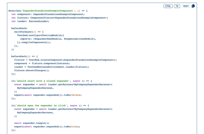
The HTML code of the demo component appears right below the demo component. The menu on the top right component allows you to switch between the HTML and the TypeScript code. Furthermore, it also allows you to copy the showcase code to the clipboard.

Another nice feature is that we display the HTML and the TypeScript code and the tests.
In the previous section, we mentioned harness tests. Since it makes testing more fun. So of course, we also test our component with harness objects.
Not only the demo code is available and copiable for consumers of our library, but also the test code. Pretty neat, right?
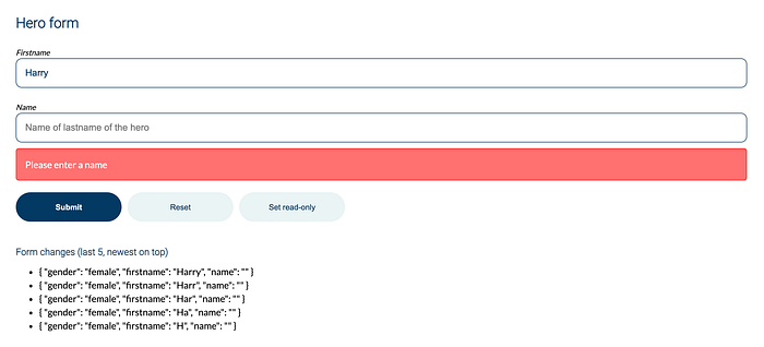
Form field integration
Last but not least. It's a very good practice to showcase all of your components in a form. Many components will be used with forms. Therefore its pretty useful to showcase and test them with a "Submit", "Reset" and a "Set read-only" functionality.

Summary
Implementing your own Angular component library is fun but it's also very hard. It requires a lot of experience and know-how.
The concepts listed above have proven themselves in big enterprise projects. But it takes quite some time to set up everything and make all the technologies work.
If you want to save yourself and your company many days of setup code I recommend you to purchase our starter and immediately start with implementing your first component for your brand new Angular component library.

Welcome to the world of Angular excellence — angularexperts.ch
Do you find the information in this article useful? — We are providing tailored expert support for developing of your Angular applications. Explore our wide range offers on angularexperts.ch
